My browser of choice for development is Google’s Chrome Canary, a very frequently updated bleeding edge build of Chrome allowing you to preview upcoming features. One feature that I’ve been very fond of since its first introduction is the device emulation, and that’s what I’m going to talk about here.
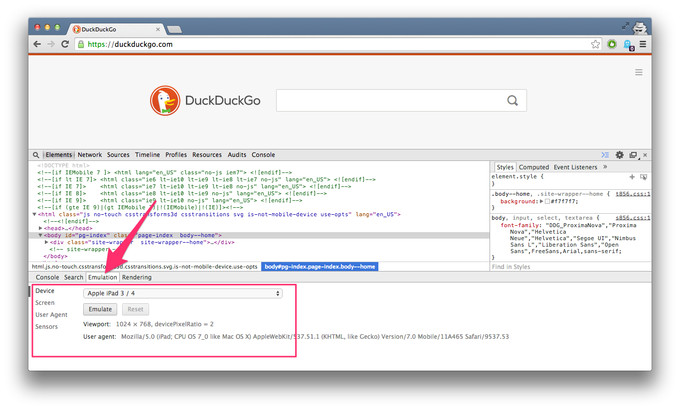
It’s been around for quite a while, here you can see it in the current stable channel of Chrome (version 36 as of publishing), and I was delighted to find a completely redesigned and improved interface land in a recent build of Canary.
All the old features are still there, including overriding of the user agent, screen size, geolocation and orientation. But the most used ones are now presented in a clean new interface which allows you easily change the viewport size without resizing the whole browser and visualises the break points from you media queries. There’s also a brand new feature to throttle the network connection to simulate slower and/or more unreliable network connections.
Here’s a quick demonstration of the new interface:
Of course this doesn’t replace true device testing, either on the actual browsers/devices themselves in a device lab or using a service like BrowserStack or Sauce Labs, but it does allow you to get a good idea if the design “works” on those devices.
Originally published on theparticlelab.com on 22nd August 2014